FOR INFLUENCERS & PUBLIC FIGURES
How to design YouTube thumbnails that look like you
YouTube thumbnail design for UK creators: the official specs, a recognisable template system, faces, type and colour, and how to test thumbnails properly.

How UK creators can build an Instagram feed aesthetic that looks like an editorial spread: a consistent edit, colour palette, cover frames and a planned mix.
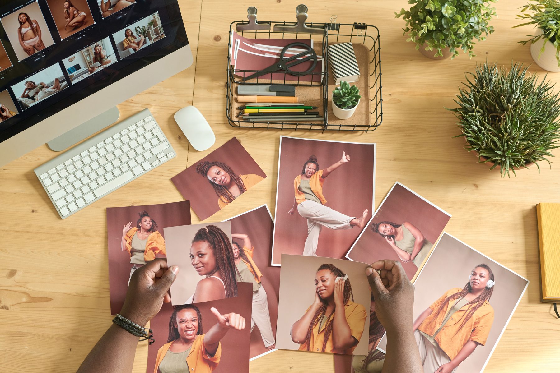
A strong Instagram feed aesthetic comes from a few decisions you make once and then repeat: one consistent edit, a small colour palette, a mix of formats planned in advance, and Reel covers and portrait crops chosen with the grid in mind. Shoot in batches so images share the same light, plan the next nine posts before you publish, and pin the three posts that best explain who you are.
Imagine a brand manager opening your profile on their phone. Before they read a single caption, they see a grid that looks like an interiors supplement: warm light, a calm palette, faces and details in a rhythm that feels intentional. They don’t need to scroll for long. They already know what their product would look like in your world, and they are reaching for your email address.
That feeling of a finished, editorial feed is not luck or an expensive filter. It is a small set of habits. Here is how to build them, without turning every post into a chore.
Magazines feel cohesive because an art director makes the same choices on every page: the same light, the same type, the same colour story, with a clear rhythm between big pictures and small details. A feed works the same way. The posts that make a grid look editorial usually share:
Start with what is already true about you. Look at your best-performing posts and the ones you are proudest of, then list the colours that keep appearing: the walls of your home, the clothes you reach for, the food or products you show most. Pick three or four and write them down with a few words about the mood, such as “oat, olive, terracotta, charcoal: warm, unhurried, natural light”.
Then use that palette when you plan shoots. Choose outfits, props and locations that sit inside it. You don’t need every post to match. You need the overall impression to hold together when someone sees nine squares at once. If you also have a logo, media kit or thumbnails, the same palette should run through those, which is the work our graphic design for influencers service is built around.
A consistent edit starts in camera. Shoot in similar light, keep your white balance steady and avoid mixing harsh midday sun with warm lamplight in the same week. Then build one editing recipe and use it for everything:
Your edit can evolve over months. It just shouldn’t change every week.
Instagram says it keeps a photo at its original resolution if it is between 320 and 1,080 pixels wide and its aspect ratio is between 1.91:1 and 3:4, which means 1,080 pixels wide and up to 1,440 pixels tall. Photos outside those ratios are cropped to fit. For an editorial feed, tall portrait images use the most of the screen, so plan shoots with that shape in mind and leave room around your subject for the crop.
Reels are different. Instagram allows Reels with an aspect ratio between 1.91:1 and 9:16, with a minimum of 720 pixels and 30 frames per second, and recommends a cover photo of 420 by 654 pixels. It also notes that, at the moment, you can’t edit a Reel’s cover after you have uploaded it, so choose it carefully before you post.
Reels often make up a large share of a creator’s grid, and a random frame from the middle of a video can break the whole look: eyes half closed, motion blur, a cluttered background. A chosen cover lets each Reel sit in the grid like a still photograph from the same shoot.
The simplest approach is to capture a still image specifically as the cover on every shoot, in the same light and edit as your photos. If you use text on covers, keep the typeface, size and position consistent, and keep the words short enough to read at a glance. Check how the cover looks cropped on your profile as well as full screen.
Overly rigid grids, such as strict checkerboards or puzzle layouts, can look clever for a week and then become a trap. A looser plan tends to last longer:
Batching makes all of this easier. When a whole month comes from one or two planned shoots, as in our guide to planning a content day, the light and palette match naturally. It is also the way our social media team for influencers plans a month of posts.
Instagram lets you pin up to three posts to the top of your profile, and you can unpin them at any time, which returns them to their original place in the grid. Those three squares are your front cover, so choose them deliberately:
Review them every month or two so the top of your profile always reflects where you are now.
Yes, and this is where many aesthetic feeds go wrong. A grid that looks like a catalogue can feel distant. The most engaging editorial feeds still show the person: unposed moments, behind-the-scenes Reels, the mess before the table was styled. Keep those in the same light and edit, and they will sit happily beside your more polished images.
Stories are the release valve. They can be looser, quicker and more personal, which takes the pressure off every grid post needing to be perfect.
There is real pride in opening your profile and seeing a grid that looks like your best work, every time. We began as co-founder Jack Cartwright’s in-house team, photographing, filming and posting so his channels looked as good as his books. Through social media for influencers we plan your grid, shoot in consistent light, edit to one recipe and schedule it all, as part of our wider marketing for influencers. A clear brief, scope and fee are agreed before any creative work begins.
Presets help, but they are not magic. They only give consistent results when the original photos were shot in similar light with similar white balance. Use one or two presets as a starting point, correct exposure and warmth first, then fine-tune each image while looking at the batch side by side.
No. Aim for the overall impression to hold together when someone sees nine posts at once. A few posts outside the palette are fine, especially for partnerships or news. If most of your outfits, props and locations sit within it, the feed will still feel cohesive.
Yes. Evolve it gradually over a few weeks rather than overnight: introduce the new palette and edit in a handful of posts, then let it take over. Pin three posts in the new style so visitors see your direction first. Archiving old posts is optional and rarely necessary.
Many do, because your grid shows how their product would look in your content. A consistent, well-lit feed suggests you will present their brand carefully. It works alongside your audience data and media kit rather than replacing them, but it is often the first impression.
It depends on how often you post. Many creators find that one planned content day a month, plus everyday clips and stories, covers most of their feed. The key is shooting enough variety on each day: portraits, details, wide scenes and Reels.
YouTube thumbnail design for UK creators: the official specs, a recognisable template system, faces, type and colour, and how to test thumbnails properly.
When ads for influencers are worth paying for in the UK: launching your own product, growing a newsletter, and when boosting a post is a waste…
What influencer whitelisting means for UK creators: how partnership ads work on Instagram, TikTok and YouTube, what access you give and what to agree first.
Four quick questions, and we’ll show you where we’d start. Your answers come straight to us with your message, so you won’t have to explain it twice.
A 30-minute introduction call on Microsoft Teams, Monday to Friday, 9am to 5pm. Your answers come with the booking, so we’ll be ready for you.
Prefer to talk it through? Make an appointment for a 30-minute call on Microsoft Teams, Monday to Friday, 9am to 5pm.
A closer look at the work behind each part of your plan.
We use analytics cookies to understand how visitors use our site. They are only set if you accept. Read our privacy policy.