FOR AUTHORS
What Should Authors Post on Social Media Between Releases?
What should authors post between releases? A balanced mix of story, process and reader posts, series reminders, countdowns and a weekly plan.

How to make a cover say its genre at thumbnail size, from crime and romance to fantasy and cosy mystery, and when to break the rules.
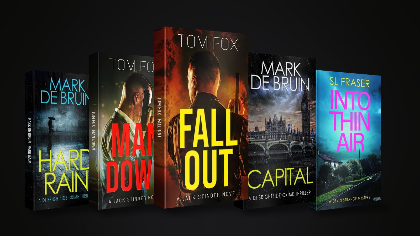
Book cover design by genre means using the visual codes readers already know, so a cover says “crime”, “romcom” or “epic fantasy” in a split second. Study the bestsellers in your category and work out what the top covers share. Match those signals at thumbnail size, and only break a convention when you can name the reason.
Most readers first see your cover as a small image in a list or a carousel. Hardly anyone sees the full-size front first. In that moment they aren’t judging the artwork. They’re working out which shelf the book belongs on and whether it’s the kind of thing they like to read, all in the second or so before their thumb moves on. Get book cover design by genre wrong and you lose readers who’d have loved the story.
This guide is about how a cover tells people its genre. Use it to sharpen the brief you give a book cover designer, or to judge a draft yourself. For the general principles behind every cover, read what makes a good book cover.
Shrink a cover to a thumbnail and the fine detail disappears. Only a few things survive: the overall colour mood, the shape of the main image and the weight of the title. Those carry the genre. Test every design small. If you can’t tell the genre from across the room, readers won’t be able to either.
Amazon’s cover guidance sets a minimum of 1,000 pixels high by 625 wide for a Kindle cover and recommends 2,560 by 1,600 for the best result. Build big. Then check how it reads once it’s shrunk. These are the signals to design for:
Crime and thrillers run on tension. Expect big, bold type, often sans-serif, in a restrained palette with one strong accent colour. The image hints at a threat without showing it. Think of a lone figure or a dark road, a rooftop or a city at night. The author name is often large, because plenty of readers in these genres shop by author.
There are differences inside the family. Police procedurals and detective series tend to look grounded and urban. Psychological thrillers feel more domestic and unsettling, while action thrillers go more cinematic. Decide which end you sit at, and make sure the typography agrees with the imagery.
Romance shows better than any genre why a “romance cover” isn’t one thing. The same label covers very different books, and readers choose by sub-category and trope.
Dress a romcom in dark colours and it’ll pull in readers who wanted something grittier, and those readers then leave disappointed reviews that put off the people it was written for. The cover should promise the book’s tone. Match the trope signals your readers are already looking for.
Fantasy and sci-fi both lean on a sense of world, but their signals split apart quickly. Epic fantasy often uses sweeping scenery, a distinctive object or a lone figure, set under ornate lettering. Urban and romantic fantasy lean towards character and colour. Sci-fi tends towards cleaner type and strong contrast. Its imagery is space and technology. Military sci-fi and space opera sit at the busier end, while cerebral or near-future books go more minimal.
Both genres are packed with detail, from maps and armour to ships and planets, and all of that is risky once the cover shrinks to a thumbnail. Keep one focal point. Keep the title readable. Save the world-building for the text and the sample, and leave it off the cover.
A cosy cover promises a gentle puzzle. Illustrated artwork and bright colour, a village or a pet, and playful lettering all tell readers the crime won’t be graphic. Cosy mystery readers are some of the most genre-savvy around, so a dark, photographic thriller look can badly mislead them and send them off to find a book that looks like what they actually want.
Non-fiction is led by the promise in its title and subtitle. Strong typography with a clear hierarchy and not much imagery usually works best. A memoir might carry a photograph or an object that hints at the story, whereas a business or self-help title can get by on type and colour alone. Ask what the reader will gain. The cover should answer it fast.
The simplest research is to open the top 20 books in your exact category on Amazon and look at them as a grid. Write down the dominant colours and the type style. Note whether the images are photographic or illustrated, and how big the author name is. Then look closely at the books that have stayed on the list for a long time, because they show you what readers keep coming back to year after year.
Amazon also publishes Amazon Charts in the UK, which lists the top 20 titles by Most Read and Most Sold, updated weekly. It takes a broad view across fiction and non-fiction instead of a niche one, but it does show what the biggest sellers look like. Keep notes. Then drop your own cover into the grid. If it looks like it belongs, you’re on the right track. If it looks like a different genre, find out why.
Rarely, and only on purpose. Conventions exist because they make choosing easier, so breaking one costs you some readers at first glance. There can be good reasons. Your book might sit between genres, or your sub-genre might be new. You might be building a brand that has to look different from everything else in a busy niche. If you go ahead, keep the key signals that tell readers the genre and change one or two other things.
A good rule is to change the style and keep the promise. A thriller can look a bit different from the pack, as long as it still reads as a thriller at thumbnail size. If your cover grabs attention but attracts the wrong readers, you’ll pay for it in poor reviews and weak read-through.
We started out as the in-house team for our founder, the USA Today bestselling author Jack Cartwright. His 60+ titles span three bestselling crime series, so we work with genre signals every day. Our book cover design for authors service starts with your genre and your comp authors, and with the shelf your book needs to sit on. You might also like our marketing services for self-published authors. We agree a clear brief, scope and fee with you before any work begins.
Look at the current top 20 in your exact category and note what they have in common. Colour, typography and image style usually fall into patterns you’ll spot quickly. Your cover should sit comfortably in that group while still being distinctive enough to remember.
It can be. A cover that looks like another genre draws the wrong readers and misses the right ones. A fresh look can work, but only if the key genre signals still read at small sizes.
Pick the audience you most want to reach and let the cover speak mainly to them. A hint of a second genre is fine. A cover that tries to say everything usually says nothing clearly.
Stop thinking of marketing as a cost. Once you do, you cut yourself off from a vital arm of your business and turn it into a negative. A cover that doesn’t match its genre is a lost opportunity, because the readers who’d love the book scroll straight past. In practice, agree the scope (the formats and the number of concepts) and a fixed fee before design starts.
It should share their signals without copying any particular design. That means things like colour mood and type weight, or image style. Readers of those authors should recognise the territory. Your name and title still need to stand out.
What should authors post between releases? A balanced mix of story, process and reader posts, series reminders, countdowns and a weekly plan.
Learn how to give every book in a series a consistent look, with colour per book, clear numbering, box set covers and refreshes that help read-through.
Why indie authors sell ebooks, paperbacks and audiobooks from their own site, how delivery works, and what to check on VAT and KDP Select first.
Four quick questions, and we’ll show you where we’d start. Your answers come straight to us with your message, so you won’t have to explain it twice.
A 30-minute introduction call on Microsoft Teams, Monday to Friday, 9am to 5pm. Your answers come with the booking, so we’ll be ready for you.
Prefer to talk it through? Make an appointment for a 30-minute call on Microsoft Teams, Monday to Friday, 9am to 5pm.
A closer look at the work behind each part of your plan.
We use analytics cookies to understand how visitors use our site. They are only set if you accept. Read our privacy policy.