
FOR AUTHORS
What Should Authors Post on Social Media Between Releases?
What should authors post between releases? A balanced mix of story, process and reader posts, series reminders, countdowns and a weekly plan.

Learn how to give every book in a series a consistent look, with colour per book, clear numbering, box set covers and refreshes that help read-through.
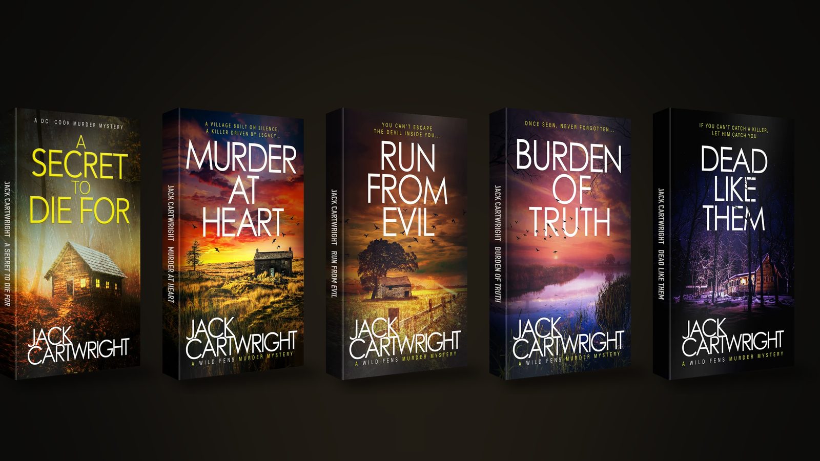
Series book cover design means giving every book the same typography, layout and image style, then changing one obvious variable to tell them apart, usually colour or the central image. Show the book number, keep the author name in the same spot, and design a box set cover that echoes the series. Readers then spot the next book instantly.
For most indie authors, a series is the most useful thing they own. Readers who finish book one are the likeliest people to buy book two. That’s why read-through (the share of readers who carry on to the next book) counts for so much in KDP and Kindle Unlimited. Good series book cover design is often the first sign that a book belongs to a set, and a muddled look can make a reader doubt it.
This guide is about the system behind a series look. Plan it early. If you want the principles of a single cover, read our guide to what makes a good book cover.
Readers should be able to line your books up on a shelf, or see them in an Amazon carousel, and recognise one family. Three things do most of that work, so lock them down first:
A master template built at one size for every format helps a lot. KDP’s own guidance for Kindle covers gives ideal dimensions of 2,560 pixels high by 1,600 wide. Build the series template to that size and every book starts from the same frame.
You want consistency. That’s the point. Still, covers that are identical apart from the title are hard to tell apart in a list, so pick one variable to change for each book. A designer working on series book covers will normally build this into the system from day one.
Shifting the colour is the simplest method and the most reliable. Each title gets its own dominant colour from a planned palette while everything else stays fixed. Choose the palette before book two so you don’t run out of distinct colours by book six, and check that each one still reads well at thumbnail size.
Some series keep the same device, like a skyline or a doorway or a single object, and change what appears inside it. This works well for crime and thriller series, where the setting or a key clue can change while the framing stays put.
When in doubt, change less. Don’t move the author name or the series line, and don’t touch the typographic style. Readers trust what looks familiar. Familiarity is what a series is selling.
People skimming a list want to know where to start. Make the order obvious. A numeral, or the words “Book 2”, in a consistent spot does the job, and a short line such as “A Detective Name Mystery” can sit above or below the title. Keep it small enough that it doesn’t fight the title, but big enough to survive being shrunk.
Number from the very first book. Adding numbers to a series that launched without them means redoing every cover, which is a strong argument for planning the system before you publish anything. The numbers on the covers should also match the reading order on your series page. KDP lets you create a series page from your Bookshelf and reorder titles whenever you like, and linked formats get added together.
A box set cover has another job entirely. It has to say this is several books, and that it’s good value. The usual approach is to show the series look in miniature, either by arranging the individual covers or by combining their motifs into one image. Then add a plain “Books 1 to 3” or “The Complete Series” line.
Design the individual covers with the box set in mind. If the colours sit well together and the layout is strict, the box set almost builds itself. KDP notes that Kindle boxsets can be added as related content on a series page. That way a bundle and the single titles can sit side by side.
Refresh when the older books are holding the series back. Shifting tastes alone aren’t a good enough reason. The usual triggers are:
Always start with book one, since it’s the series starter. If you can, roll the new look out across the whole series at once, because a mismatch can do more damage than the old design ever did. Change the covers for every format at the same time, audiobook included. They should all agree.
A strong series look works away in the background. It tells a reader on book one that more is waiting. It also makes the next book easy to spot in your back matter and on your series page, and in any ad you run. Ads and social posts start to feel like one campaign too, and so do newsletter swaps. People recognise the creative at first glance. The book itself does most of the work on read-through, but the cover takes away any doubt about what comes next.
Our team started as the in-house team for our founder, the USA Today bestselling author Jack Cartwright, who has sold over a million books and written 60+ titles across three crime series. Series design is part of our everyday work. Through our book cover design for authors service we can build a flexible template and palette for your series. Then we adapt it for ebook and paperback, hardback, audiobook and box set. For the wider picture, see how we market self-published authors. We agree a clear brief, scope and fee with you before any work begins.
No. The structure should match, and one element, usually colour or the central image, should change. Identical covers are hard to tell apart in a list and leave readers unsure which ones they’ve already read.
You need enough for the full length of the series, so plan beyond the first three books. If you might write ten, choose a palette that can stretch that far. Or use one colour family in different shades, so every cover stays distinct but obviously related.
Not necessarily. A new series can have a system of its own. Book one of an existing series, though, is worth reviewing whenever the later covers have moved on, because it’s the book most new readers meet first.
Stop thinking of marketing as a cost. The moment you do, you cut yourself off from a critical arm of your business and turn it into a negative. A series that looks unplanned is a lost opportunity, because readers who liked book one may never find book two. In real terms, agree a scope covering the template, the number of titles and the formats, then fix a fee before design starts.
Yes, but plan the change across the whole series. A partial update leaves two looks on the same series page, which confuses people. Redo all the covers in one go, starting with book one, and update every format together.
What should authors post between releases? A balanced mix of story, process and reader posts, series reminders, countdowns and a weekly plan.
Why indie authors sell ebooks, paperbacks and audiobooks from their own site, how delivery works, and what to check on VAT and KDP Select first.
How to design the page that gives away your free book: headline, cover, form, UK consent basics, the welcome sequence and where readers come from.
Four quick questions, and we’ll show you where we’d start. Your answers come straight to us with your message, so you won’t have to explain it twice.
A 30-minute introduction call on Microsoft Teams, Monday to Friday, 9am to 5pm. Your answers come with the booking, so we’ll be ready for you.
Prefer to talk it through? Make an appointment for a 30-minute call on Microsoft Teams, Monday to Friday, 9am to 5pm.
A closer look at the work behind each part of your plan.
We use analytics cookies to understand how visitors use our site. They are only set if you accept. Read our privacy policy.