FOR PODCASTERS
How to light a video podcast set
A practical UK guide to video podcast lighting: key, fill and practical lights, two-person desks, backgrounds, flicker under 50 Hz mains and a look that stays…

Podcast cover art specs for Apple Podcasts and YouTube, plus what makes artwork stand out at thumbnail size and how it fits your wider brand.
Good podcast cover art is square, 3000 x 3000 pixels, saved as a JPG or PNG with no transparency, and readable at the size of a thumbnail on a phone. Beyond the specs, it should tell a browsing listener in a second what the show is about and how it feels: a short, bold title, one strong image or photo, a limited colour palette and nothing small or fussy. It also needs to work as a YouTube thumbnail and alongside your clips.
Imagine scrolling a category in Apple Podcasts and spotting your own show at once: bold, clear and unmistakably yours among a hundred tiny squares. A listener taps it before reading a word, and when they later find your clips and your YouTube episodes, the same look greets them there too. That is what well-made cover art feels like.
Your cover art is the first thing most potential listeners see, usually as a small square among dozens of others in Apple Podcasts, Spotify or YouTube. They won’t read your description until the artwork has persuaded them to tap.
That makes it one of the highest-value pieces of design in your whole podcast. This guide covers the official requirements, what separates artwork that stands out from artwork that blends in, and how to make it part of a wider brand rather than a one-off image.
Apple’s requirements are the ones most hosting providers and directories work to, so they are the safe standard to design for:
| Requirement | Apple Podcasts show cover |
|---|---|
| Size | 3000 x 3000 pixels recommended; 1400 x 1400 to 3000 x 3000 accepted through RSS |
| Shape | Square |
| File type | JPG or PNG |
| Transparency | None: no alpha channel, so use a solid background |
| Not allowed | Any visual representation of Apple, including logos or hardware |
Apple also provides a Show Cover template with a safe area, so key elements are not cropped or covered by interface elements such as the play button and labels. Design at 3000 x 3000 from the start; scaling up a smaller image later always shows.
On YouTube, a podcast needs a square thumbnail, and YouTube recommends 1280 x 1280 pixels. If you send your audio episodes to YouTube by RSS, each one becomes a static image video built from your show art, so your cover may be the only visual some viewers ever see. Check that it still looks right on a large screen, not just a small one.
Look at the top of any category in Apple Podcasts or Spotify and the strongest covers share a few qualities.
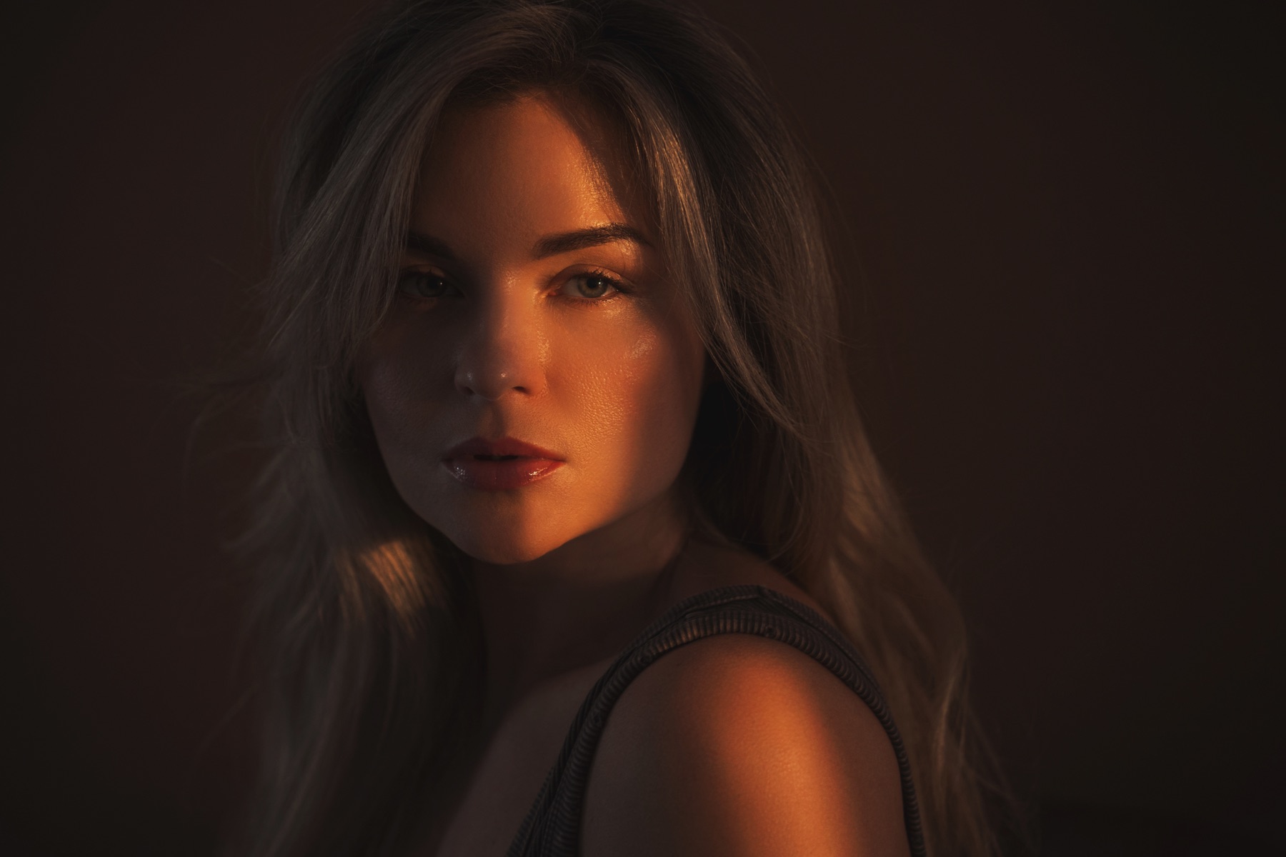
If the podcast is built around you, usually yes. Listeners choose personality-led shows partly on who is talking, and a face creates a connection that type alone can’t. That is especially true if you’re a business owner, coach or expert using the podcast to build your profile, because the cover becomes part of your personal brand.
The photo has to work hard, though. It needs strong, deliberate lighting, a clean background that leaves room for the title, and an expression that matches the tone of the show. A cropped holiday snap or an old corporate headshot rarely does. A dedicated session gives you a cover image plus matching photos for episode art, guest graphics and press; our guide to podcast host photos covers which shots to plan.
If the show is about a subject rather than a person, or has rotating hosts, an illustration or typographic cover can be the stronger choice.
It’s optional, and it can be useful for interview shows where the guest is the draw. Apple’s episode art is also square at 3000 x 3000 pixels, but Apple advises avoiding your podcast logo or any text, because the episode and podcast titles are shown beneath it. So episode art should be a strong image, often a photo of the guest, rather than a mini version of your cover.
Our guide to podcast episode artwork covers when it is worth the effort and how to template it. Episode art is a supporting act. Your show cover is what people see when they browse, search and follow, so it still has to do the main job.
Your cover is the anchor for everything else people see: YouTube thumbnails, clip captions, guest share graphics, your website and, if you film, your set. When they all share the same colours, type and photographic style, each piece reinforces the others and the show becomes recognisable in a feed before anyone reads the name.
That is why it’s worth treating cover art as a small brand identity rather than a single image. At minimum, decide on:
Templates and design tools make it possible to produce something acceptable yourself, and for a hobby show that may be all you need. The limitation is that templates are used by thousands of other shows, so the result often looks familiar rather than distinctive.
It’s worth hiring a designer when the podcast represents your business, when you’re relaunching an existing show, or when you want artwork that holds up next to the professionally produced shows in your category. A good designer will start with your audience and positioning, not with a mood board of other podcasts. That is how we approach graphic design for podcasters.
Rebranding has a cost: existing listeners recognise your current cover, and a sudden change can confuse them. A redesign is worth it when the show has changed focus, when the artwork no longer reflects its quality, or when it fails the thumbnail test. Keep the name and some recognisable element, update everything at once, and mention the new look in an episode so listeners know it’s still you.
We want you to feel proud every time your square appears in a scroll of hundreds. Our team began by looking after Jack Cartwright’s book covers, website and social media, so we know how hard one small image has to work. Through graphic design for podcasters, we design cover art and the identity around it, and can shoot the photograph it’s built on, as part of our marketing for podcasters. A clear brief, scope and fee are agreed before any creative work begins.
Design at 3000 x 3000 pixels, square, and export as a JPG or PNG with no transparency. Apple accepts artwork from 1400 x 1400 pixels through RSS, but prefers the largest size. Your hosting provider may also have a file size limit, so check its upload screen before exporting.
Yes, and for a personality-led show it often works well. Use a professionally lit photo with a clean background and enough space for the title. Make sure you own or have licensed the image, which includes checking the terms with the photographer who took it.
You can, but check the tool’s terms on commercial use and look closely for errors in text, hands and faces. AI images can also look generic, which works against standing out. Separately, Apple requires AI-generated audio or video in the content itself to be disclosed prominently.
Rarely. Consistency helps listeners recognise your show over time. Consider a redesign when the show’s focus changes, the quality of the artwork lags behind the quality of the episodes, or it can’t be read at thumbnail size. Change everything together so your brand stays consistent.
If the podcast exists to build your business or personal brand, it should feel related, so listeners make the connection. It doesn’t have to be identical. Many shows use the business’s colours and type with a more expressive image, so the podcast has its own personality within the same family.
A practical UK guide to video podcast lighting: key, fill and practical lights, two-person desks, backgrounds, flicker under 50 Hz mains and a look that stays…
How to promote a podcast on Instagram in the UK: Reels from every episode, Stories on release day, guest collabs, trial reels and posting between seasons.
How to write podcast show notes that persuade people to press play and help episodes get found in search, with a simple template, timestamps and transcripts.
Four quick questions, and we’ll show you where we’d start. Your answers come straight to us with your message, so you won’t have to explain it twice.
A 30-minute introduction call on Microsoft Teams, Monday to Friday, 9am to 5pm. Your answers come with the booking, so we’ll be ready for you.
Prefer to talk it through? Make an appointment for a 30-minute call on Microsoft Teams, Monday to Friday, 9am to 5pm.
A closer look at the work behind each part of your plan.
We use analytics cookies to understand how visitors use our site. They are only set if you accept. Read our privacy policy.